

Checking proofs
A proof is your last clear check before the full print run starts. Taking a few careful minutes here can prevent costly reprints, delivery delays and colour surprises.
Start with the final file, not an older draft
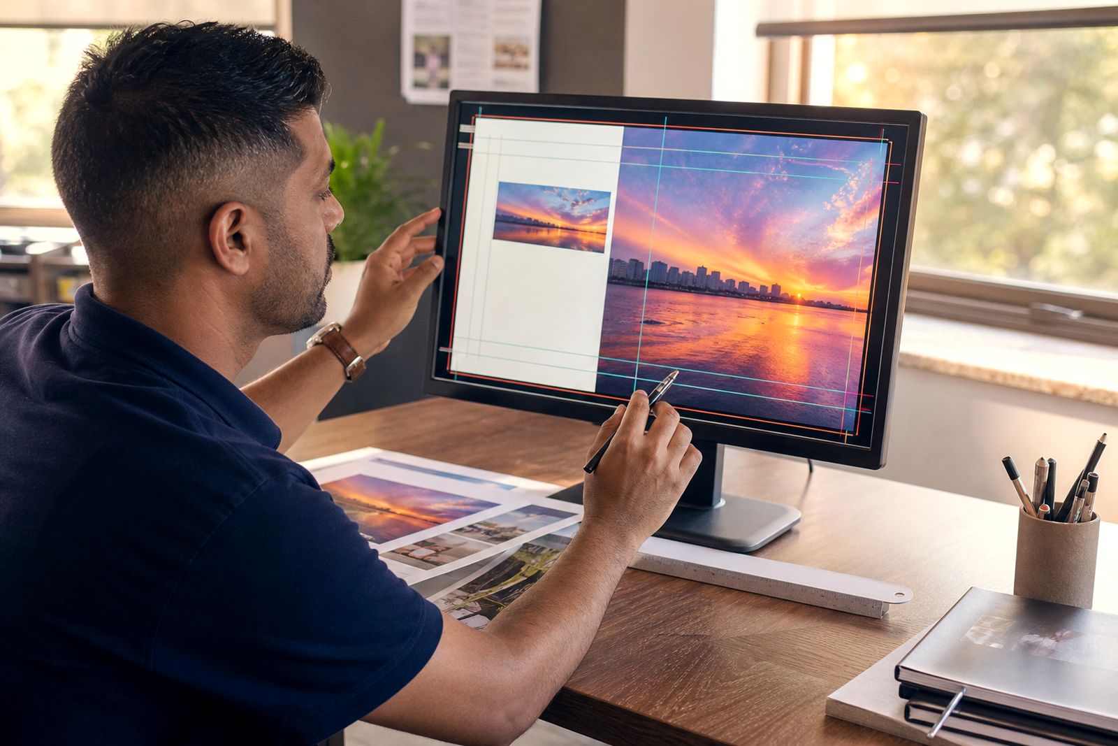
Before you review any proof, make sure the artwork supplied for proofing is the exact version meant for print. Many approval problems start when an earlier draft is checked by mistake, especially on brochures, magazines and annual reports where several contributors have updated text or images. Confirm the file name, page count and revision note first, then begin the visual check.
If more than one team is involved, nominate one person to collect changes and give the final sign-off. That keeps comments consistent and avoids a situation where one department approves a proof while another is still editing. For medium-run commercial work this matters because once plates are made or the digital run starts, changes can mean extra time and added cost.
- Check the job title and version number on the proof.
- Confirm the total number of pages or panels.
- Make sure all late text corrections were included.
- Verify that logos, legal lines and contact details are current.
- Approve from the final supplied PDF, not from a marked-up layout on screen.
Read for content before you judge colour
It is tempting to look at pictures and colour first, but the copy check should come before anything else. Read the proof slowly and in order. Check headings, body text, captions, tables, references and page numbers. On annual reports and corporate print, pay special attention to financial figures, names of divisions, graph labels and disclaimers. On magazines and brochures, look at contents pages, article jumps and image captions.
Proofing is not just a spelling exercise. You also need to catch awkward line breaks, missing words, duplicated paragraphs and text that has reflowed after a late correction. If the proof is folded work, such as a leaflet, check that panel order reads correctly once folded. A small text shift can put important copy too close to a trim edge or fold, which can look untidy in the finished piece.
- Read every page at 100% size where possible.
- Check spelling, punctuation and grammar.
- Confirm page numbers, contents listings and cross-references.
- Review dates, totals, URLs and product codes carefully.
- Make sure no text is cut off at the edge of a text box.
Check colour with realistic expectations
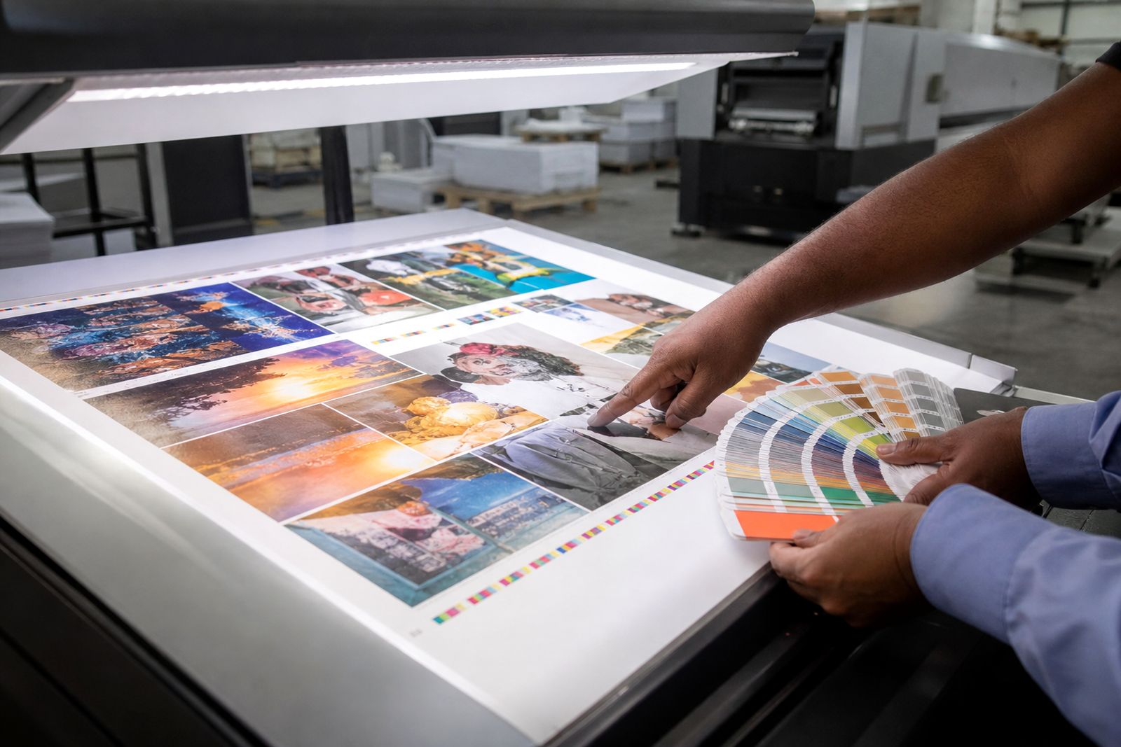
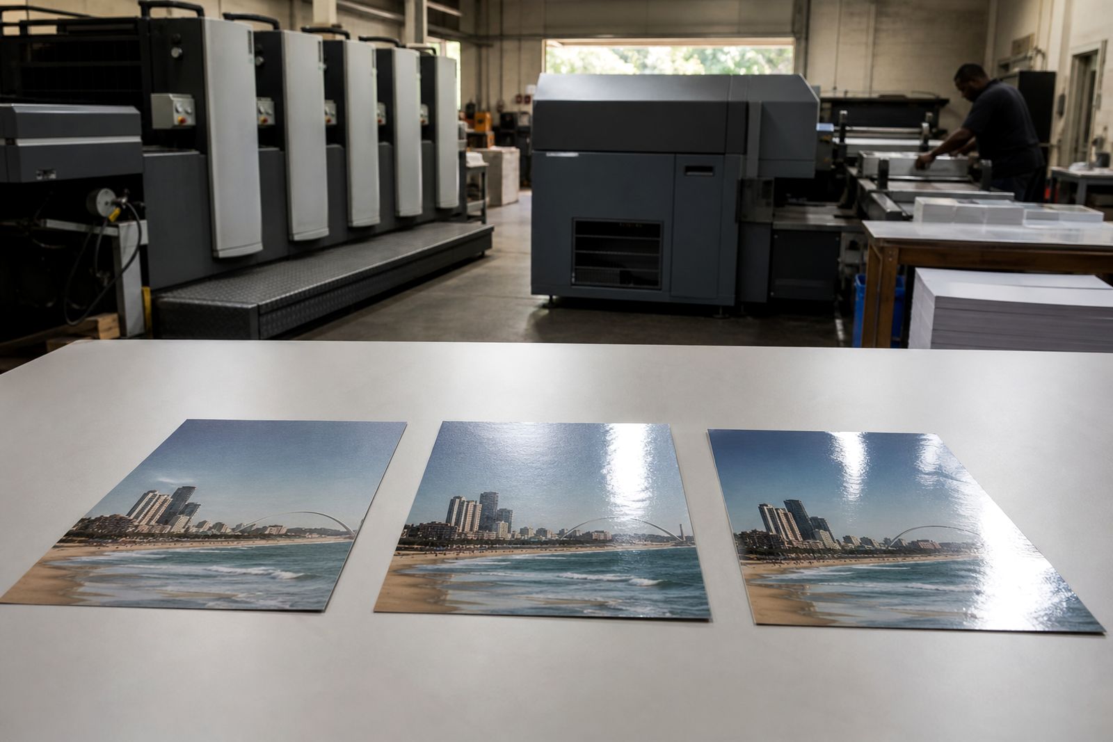
A proof helps you judge colour direction, image balance and general appearance, but not every proofing method will match the final sheet exactly. Screen viewing can vary by monitor brightness, office lighting and even power cuts if systems restart with different settings. Printed proofs usually give a better guide than an office screen, especially for skin tones, dark backgrounds and solid colour areas.
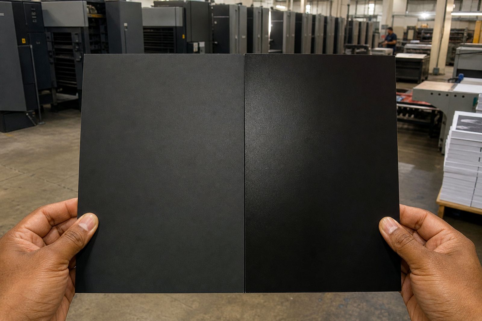
When reviewing colour, look for consistency rather than perfection on a single image. Does the company blue look right across the set? Are photographs too warm, too dull or too dark? Are grey tints neutral, or do they lean pink or green? If a job contains large black areas, remember that rich black builds and plain black can appear different between proof and press. If exact appearance is critical, note it clearly when approving so the press team can watch it on press.
- Compare key colours across all pages, not one page only.
- Check faces, food, products and interiors for natural colour.
- Look at dark images for loss of detail in shadow areas.
- Review gradients and large tints for banding or patchiness.
- Flag any page where brand colour is especially important.
Review trim, folds, margins and pagination
Good print can still look poor if the layout is not positioned correctly for trimming, folding or binding. Check that images intended to bleed run fully past the trim line. Text, page folios and logos should sit safely inside the trim so they do not look crowded after guillotining. For saddle-stitched magazines or brochures, page order and centre spread alignment should be reviewed carefully. For perfect bound work, allow for content close to the spine that may become harder to read.
Folded leaflets and corporate folders need extra attention. A panel that is slightly narrower for the fold-in flap must be supplied correctly, otherwise the piece can buckle or sit unevenly. If the job includes perforations, drill holes or custom finishing, make sure these positions are shown on the proof and checked against the artwork. It sounds obvious but this step gets missed more often than it should.
- Check bleed on all outer edges where artwork should run off.
- Confirm safe margins around text and logos.
- Review fold positions and panel sequence.
- Check page order for multi-page documents.
- Mark any special finish positions before approval.
Confirm paper and finishing notes
A proof is also the moment to confirm production instructions. The artwork may be correct while the job ticket is not. Check whether the job is single-sided or double-sided, full colour throughout or mixed with black-only pages, and whether covers differ from inners. For brochures, annual reports and presentation pieces, cover finish matters because gloss, matt or uncoated stock can change the feel and the colour appearance.
Review all finishing notes before sign-off. That includes folding style, stitching, perfect binding, trimming to final size, and any cover treatment. If the job will be used in humid coastal conditions around Durban and wider KwaZulu-Natal, discuss practical stock choices if the piece must travel, be mailed or sit in storerooms. Some applications need a more durable option than a basic handout, while everyday flyers often do not.
Send clear corrections and give one final approval
When you spot an issue, mark it clearly and group all changes into one response where possible. Scattered messages from different reviewers slow production and increase the chance of something being missed. Use simple instructions such as replace, move, delete or amend, and identify the exact page and item. If the correction affects pagination, image size or copy flow, ask to see a revised proof before print approval.
Once everything is checked, provide one clear go-ahead through the website enquiry route or file process used for the job. Your approval should state that the proof is correct for content, layout and print production as shown. After that point, the press run can be scheduled with confidence and turnaround is easier to keep on track.
- Collect feedback from all stakeholders before replying.
- Mark corrections page by page.
- Do not assume small edits are risk free, check the revised proof again.
- Give one final approval from the authorised contact person.
- Keep a copy of the approved proof for your records.
What our Commercial Printing customers say
Verified Google reviews
Questions we get asked
What is the main purpose of a print proof?
A print proof lets you check content, layout, pagination, colour direction and production notes before the full run starts. It is the last practical stage to catch errors before they become costly.
Can I approve a job from a phone screen?
It is better to review from a full-size PDF on a larger screen or from a printed proof where available. Phone screens can hide text issues and give an unreliable view of colour and detail.
Should I ask for another proof after making changes?
Yes, if the corrections affect text flow, image size, page order, folds or any important colour area. A revised proof reduces the risk of approving a new mistake introduced during amendments.
Also worth a look
Ask for a quote
Send a note through the contact form with your print job, quantity, size, finish and delivery area, and the team will reply with a quote.
Open the contact form