

Preparing print files
Good print starts with a clean file. This guide covers the basics that help brochures, magazines, reports and everyday marketing pieces move through prepress with fewer delays.
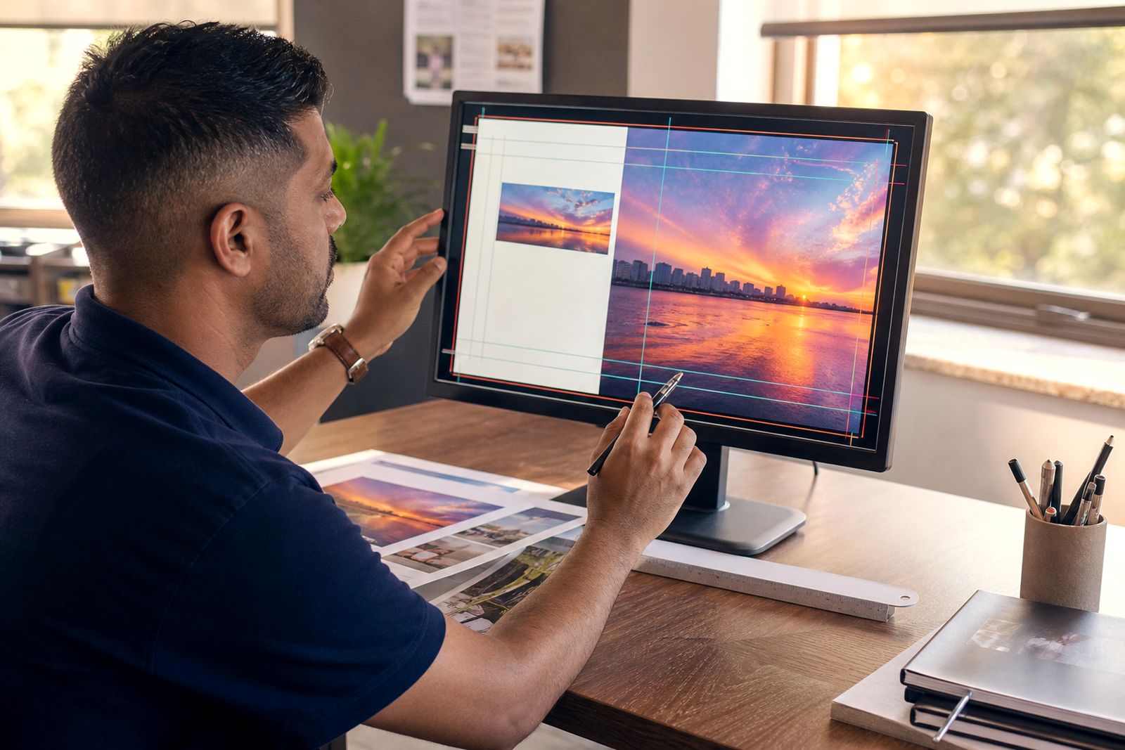
Start with the correct document setup
Before you place a single image or logo, set your document to the final trimmed size. If a brochure is A4, build it at A4. If a flyer is DL, build it at DL. Avoid scaling artwork up or down at the last stage, because text size, image sharpness and bleed can all be affected.
Add bleed on every edge where colour, images or background tints run off the page. A common setup is 3 mm bleed on all sides. Keep important text, logos and page numbers safely inside the trim edge as well. A good rule is at least 5 mm in from the trim, and more on smaller items where space is tight.
- Set the page to the final trimmed size.
- Add 3 mm bleed on all sides unless your job spec says otherwise.
- Keep live content at least 5 mm inside the trim.
- Set facing pages correctly for magazines and booklets.
- Check page count and reading order before export.
If you are unsure about size or folding panels, send a quote request through the contact page first. It saves time later and helps avoid awkward panel widths on roll folds or gatefold work.
Use images that will hold up in print
Images that look fine on screen can print soft if their resolution is too low. For most commercial print work, aim for 300 dpi at the final size used in the layout. Large background images may be slightly lower in some cases, but they still need enough detail to avoid a fuzzy result.
Be careful with pictures pulled from messaging apps, social platforms or office documents. These are often compressed and too small for print. If an image must fill an A4 page, it needs far more detail than a small picture used in a corner. A stretched low-res image nearly always shows its weakness on press.
- Use high-resolution images, ideally 300 dpi at final size.
- Do not enlarge small web images for print use.
- Check that logos are vector where possible.
- Crop and place images neatly rather than masking rough screenshots.
- Make sure image links are updated before packaging or exporting.
For logos, line icons and sharp diagrams, vector artwork is best. It stays crisp and scales cleanly. If you only have a raster logo, inspect it closely at the size it will print, because jagged edges become more obvious on coated stock.
Set colour for print, not for screen
Commercial printing works in CMYK, not RGB. Files supplied in RGB can still be converted, but colours may shift, especially bright blues, greens and neon-looking tones that screens display more easily than ink can reproduce. Rich, saturated colour is possible in print, but it needs to be built within realistic process colour limits.
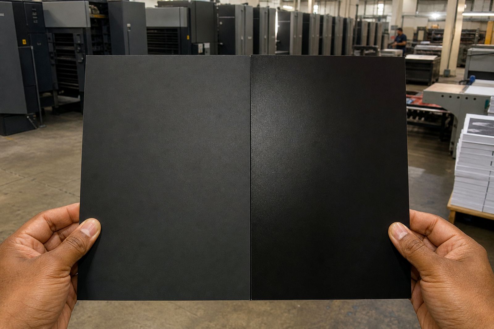
Keep an eye on black as well. Small text should normally be 100% black only, so it prints sharply. Large black areas like solid backgrounds may need a richer build for better depth, but that should be used with care. Too much combined ink can cause drying or marking issues, particularly in humid coastal conditions around Durban where paper handling matters.
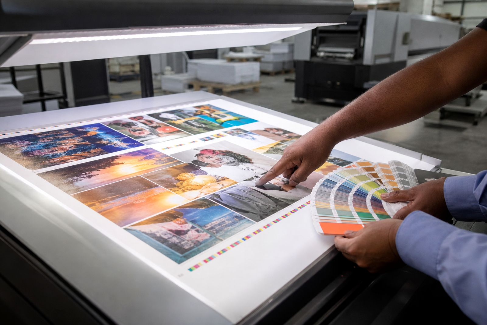
If colour is critical, ask for a proofing route that matches the job type. A supplied office print is useful for content checks but not for exact colour approval. When several stakeholders are reviewing, make sure everyone signs off the same version, otherwise teh job can get held up by conflicting mark-ups.
Handle fonts, transparency and artwork carefully
Missing fonts are a common cause of file delays. If your workflow requires an open file, package the document properly and include all fonts and linked graphics you are licensed to share. If you are sending a print-ready PDF, it is still wise to check that fonts are embedded and that no text has reflowed during export.
Transparency effects, overprints and layered artwork can also create surprises if not checked properly. Drop shadows, tint overlays and placed files from other software should be reviewed at high zoom before final export. Thin white rules, hidden layers and accidental spot colours often slip through when a file has been revised many times.
- Embed or package fonts correctly.
- Check that no text has overset or reflowed.
- Review transparencies and drop shadows for clean output.
- Remove unused spot colours unless they are intentional.
- Outline only where necessary and after final text approval.
If you are building an annual report or longer publication, keep styles and page elements consistent from start to finish. A tidy file is quicker to process and easier to proof accurately.
Export a press-ready PDF
In most cases, the best file to supply is a press-ready PDF exported from your layout application. Use the correct preset for commercial print and make sure bleed marks are included only if requested. The important thing is that the PDF contains the final trim size, the bleed area, embedded fonts and properly converted images.
Do not rely on default office PDF settings. These often downsample images too heavily, flatten artwork in unhelpful ways or leave colour in the wrong space. Before sending, open the PDF and inspect it page by page. Look at small type, image edges, page sequence and any pages with full background colour.
- Export to a print-quality PDF preset.
- Include bleed in the export.
- Embed fonts.
- Keep page order correct for reading, not printer spreads unless asked.
- Review the PDF before upload.
For multi-page work, send one complete PDF unless a different workflow has been agreed. Separate page files can slow things down and increase the chance of version mix-ups.
Run a final preflight before you send files
A quick final check can prevent most avoidable corrections. Compare the exported PDF against your approved layout and make sure nothing has changed. Confirm page count, trim size, bleed, spelling, contact details, image quality and finishing notes. If the job folds, check panel order. If it binds, check inside margins and creep allowances where relevant.
It also helps to name files clearly so there is no doubt about what should print. Use version names that make sense and avoid uploading several near-identical files without notes. If the job includes special instructions such as a matt laminated cover, scoring on heavier stock or sequential versions, mention that in the website form when sending your files.
Our file upload guidance and quotation request pages work best when the brief is simple and complete. If there is a hard launch date, say so early. That helps with planning proof approval, press time and finishing, especially when power cuts or courier timing put pressure on deadlines.
A clean file does not guarantee perfect print on its own, but it gives the job a far better start and usually means fewer back-and-forth corrections.
What our Commercial Printing customers say
Verified Google reviews
Questions we get asked
How much bleed should I add?
For most commercial print jobs, add 3 mm bleed on every side where colour or images run to the edge. Keep important text and logos at least 5 mm inside the trim.
Can I send RGB artwork?
It is better to prepare artwork in CMYK for print. RGB files can be converted, but some bright screen colours may change when printed.
What file format should I upload?
A press-ready PDF is usually the best option. Make sure fonts are embedded, images are high resolution and bleed is included in the export.
Also worth a look
Ask for a quote
Send a note through the contact form with your print job, quantity, size, finish and delivery area, and the team will reply with a quote.
Open the contact form